 Find out More
This week, we’ve got something fun and a bit different lined up. AI has been a hot topic for quite a while now, so we decided to run a little experiment.
We asked a bunch of AI systems a simple question: what makes the perfect OTT front-end platform?
The results were pretty interesting, covering everything from design to user experience. So, grab a seat, and let’s dive into what these AI systems have to say.
“The perfect OTT front-end platform offers an intuitive interface for seamless navigation and personalized content discovery. It ensures compatibility across various devices, maintaining a consistent user experience. With a vast library of high-quality content, including movies, TV shows, and originals, users can enjoy immersive viewing experiences in 4K Ultra HD and HDR formats.
Advanced search and filtering options streamline content discovery, while interactive features like live polls enhance community engagement. Accessibility features ensure inclusivity, with closed captioning and multiple language support. Flexible monetization models cater to different user preferences, supported by robust analytics for data-driven decision-making.
Continuous innovation drives regular updates and feature enhancements, keeping the platform competitive and relevant. Overall, it prioritizes user satisfaction through seamless streaming, diverse content offerings, and interactive features, making it the ideal choice for modern viewers seeking premium OTT experiences.”

“The perfect Over-The-Top (OTT) front-end platform is a streamlined, user-centric interface tailored to deliver high-quality streaming experiences. At first glance, a clean design with minimal visual clutter ensures seamless navigation.
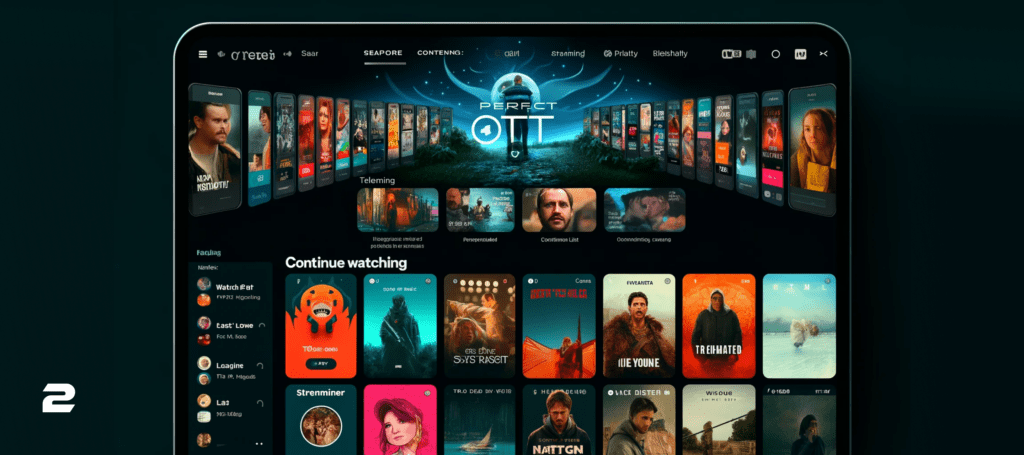
The home page welcomes users with personalized recommendations, derived from viewing history, trending content, and curated lists. Each suggestion is accompanied by vibrant cover art, providing an engaging visual preview. A robust search bar offers autocomplete suggestions, and filtering options for genre, release date, and ratings further enhance navigation.
Content-specific pages deliver detailed information, including a synopsis, cast list, trailers, and reviews. Additional buttons for play, watch later, and playlist addition make accessing and organizing content effortless. A “Continue Watching” section on the home page enables users to resume interrupted streams immediately.
To foster engagement, the platform includes social features like sharing options, watch parties, and user-generated ratings or comments. This interactivity cultivates a community atmosphere, enhancing the overall streaming experience. Additionally, a responsive design adapts fluidly to various devices, ensuring seamless playback on smartphones, tablets, and desktops.
Multiple streaming quality options cater to diverse internet speeds, ensuring smooth playback even in areas with low bandwidth. Furthermore, the platform offers a holistic hub for content discovery, blending personalized recommendations, intuitive navigation, and social interaction, making it an indispensable tool for modern streaming.”

“The ideal OTT front-end platform merges style and function for an unparalleled user experience. It features a clean, intuitive design that’s responsive and accessible, ensuring content is the star. Navigation is a breeze, with a structured menu and advanced search capabilities. Personalized recommendations and swift streaming enhance the user experience.
Content is king, with multi-language support, parental controls, and social sharing capabilities. Discover new favorites through curated collections and AI-driven suggestions. Engage with interactive content, choosing storylines or joining live events.
Technically, the platform is highly compatible and secure, offering offline viewing options. Round-the-clock customer support and a user feedback system ensure continuous improvement.
This platform stands out in the OTT market by prioritizing user satisfaction and engagement.”
“Imagine an OTT platform so intuitive, that finding your next binge-watch is a breeze. A clean interface with clear menus and high-quality previews lets you browse effortlessly. Powerful search and personalized recommendations help you discover hidden gems. “Continue Watching” keeps track of your progress across devices, so you can pick up right where you left off.
This perfect platform seamlessly transitions between your phone, tablet, and smart TV, with smooth playback and offline viewing options for on-the-go entertainment. Multiple user profiles allow for customized experiences, while parental controls ensure safe viewing for young ones. Engage with watch parties, live chat events, or interactive features that bring content to life. Share your favorites and recommendations with friends on social media.
This platform prioritizes user-friendliness, intuitive content discovery, and a frictionless viewing experience, all wrapped in a sleek and engaging interface. This is the future of OTT entertainment.”
The answers vary a lot, but every one of them agrees that the most important thing for the perfect OTT front-end platform is the experience that the final user will have while using the platform. That’s the one we fully agreed on at 2Coders Studio because the user experience was the main point that we had while building our own OTT front-end platform Velvet. Our platform is crafted to cater to the Entertainment, Sports, E-learning, and Enterprise sectors, delivering seamless content across all devices. Whether engaging customers, fans, or students, our integrated solutions captivate a wide range of audiences. Featuring high-quality video players, analytics, subscription management, and DRM, Velvet ensures secure content delivery and viewer engagement, making it a comprehensive solution for diverse needs.
If you want to find out more about Velvet or how we can help you – feel free to schedule a meeting or consultation.
